

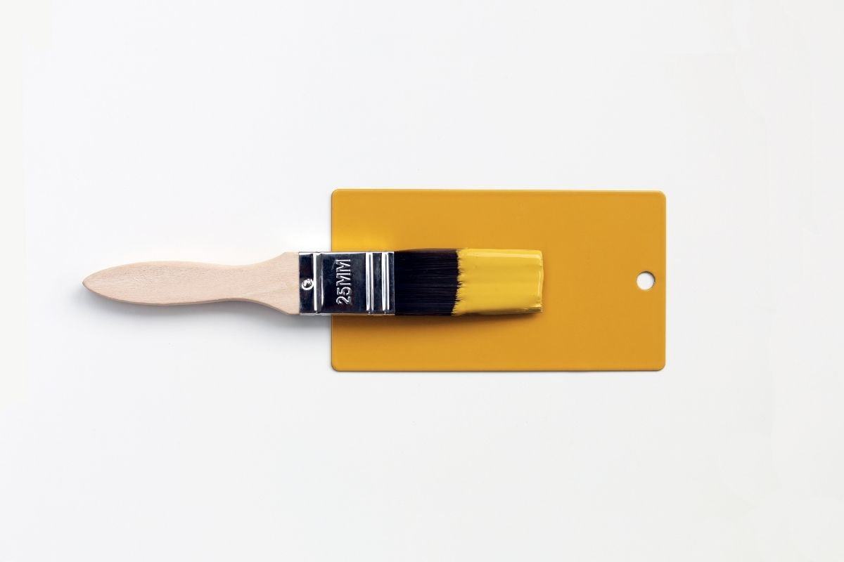
Let's talk paint colours. We’re pretty proud of our locker rainbow. Each and every colour was chosen after lots of meticulous discussion, decision-making, sampling and overthinking! So I guess it is no surprise that we get asked this question a lot… Which paint colour matches my locker? There is a really quick and easy answer, so we’re going to let you in on our colour matching hack:
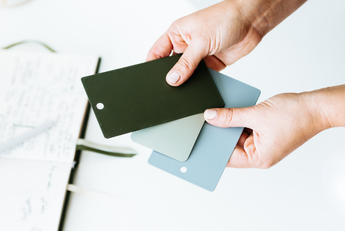
Take your keyring to a paint or DIY store. They can scan + match the colour perfectly!
Yep, it really is that easy! If you haven’t got your hands on a locker just yet or you’re just a big fan of our colours, firstly, you have great taste, and secondly, you can order one of our colour swatches and take that to the paint store instead!
This is by no means the only option though! There are so many amazing paint brands out there so we thought it would be helpful to know where to buy matching paint off the shelf! It’s not always possible to get an exact match, but we have sought high and low to find you the closest paint colours to match your locker.
Quick disclaimer: not all of these paint brands and colours will be available everywhere in the world so do check first! Also, we always recommend getting a sample to see if it truly is the colour of your dreams by testing it out in your space. We have tried to match them as closely as possible to our colours but none will be as exact a match as getting the colour scanned, so it is totally up to personal preference!
Ready made paint matches

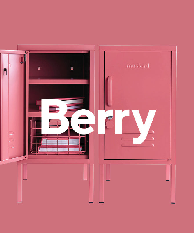
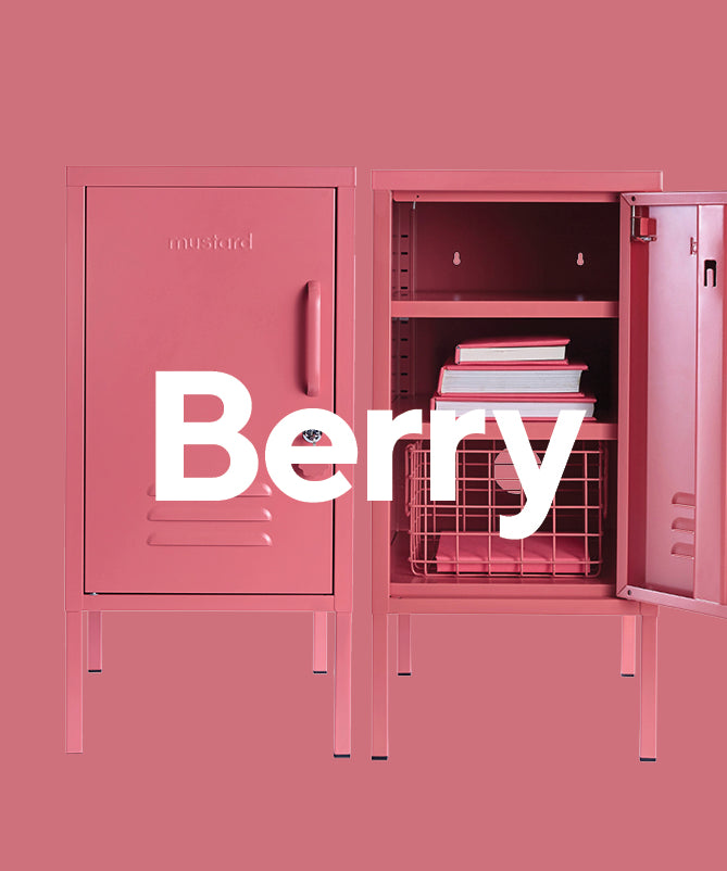
Berry
Dulux Energy Peak
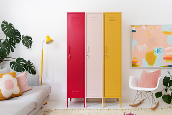
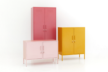
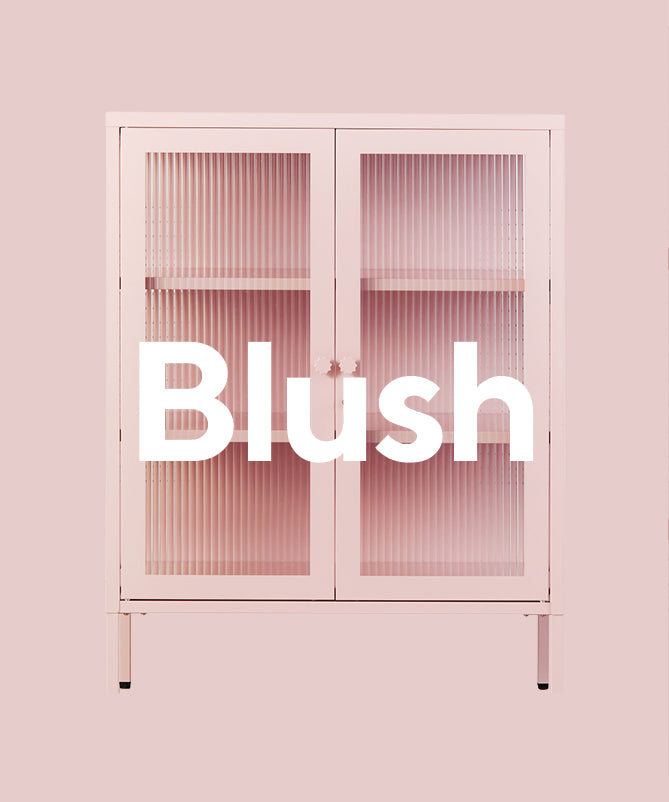
Berry is a deep, warm pink, not too bright but definitely bold enough to make a statement! Think pretty flowers + summer fruit, that’s Berry. She’s a match made in heaven for Blush (obviously!) + makes a cool, colourful statement with Navy.

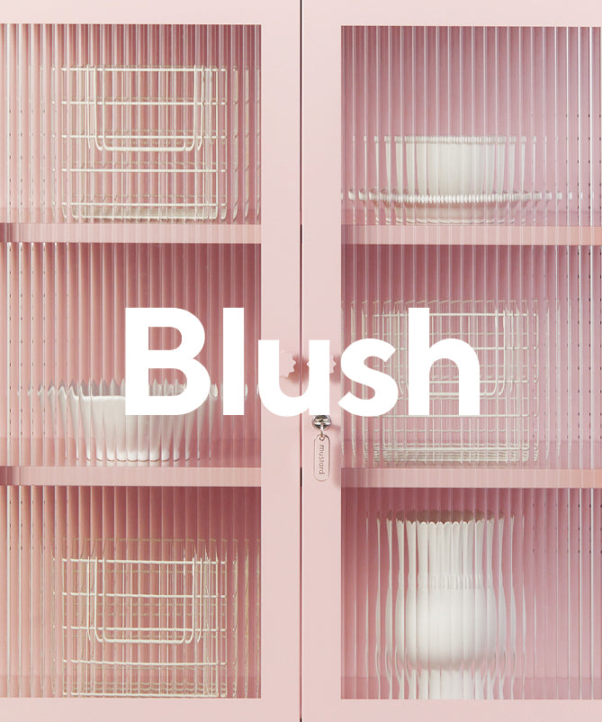
Blush

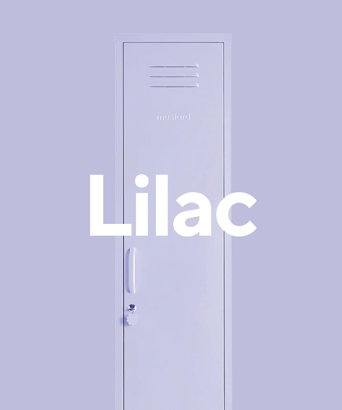
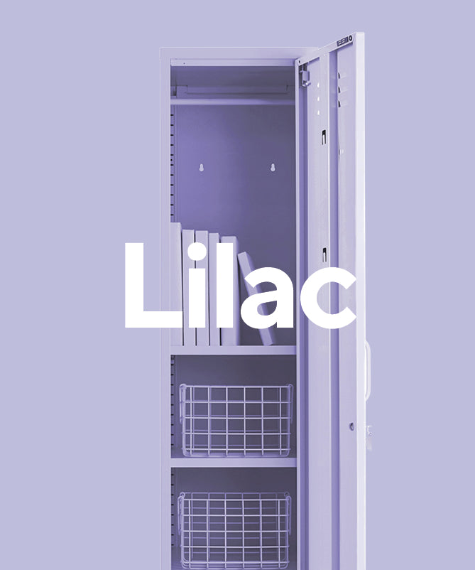
Lilac
Say hello to Lilac - the perfect, pretty, pastel addition to our rainbow. It is a dusky pale purple, a match made in heaven next to our Blush. We love seeing it next to Sage + Ocean too.

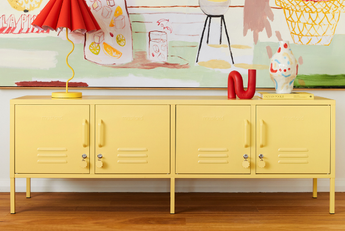
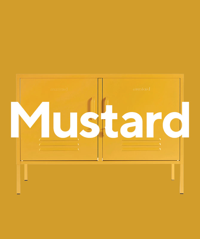
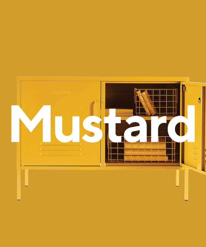
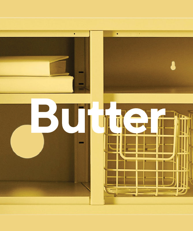
Mustard
Our namesake, our Mustard. A hot, spicy yellow, bright enough to add a pop of colour to your room with a warm undertone. We made sure Mustard goes with all of our other colours, but we love it the most next to Blush. Mustard is not for everyone, like the condiment it's an acquired taste. That's why we love it so much!

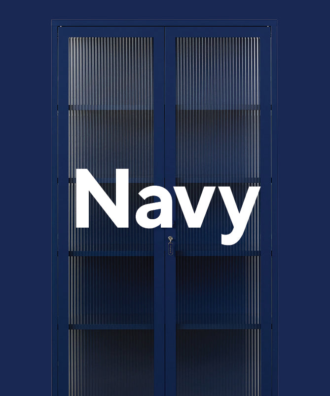
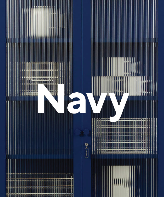
Navy
Our Navy is somewhere between navy + royal blue. Not too dark, not too bold, we’d say she’s just right. We love seeing Navy with Sage + Olive for a real nature-inspired vibe, or next to Berry for a fun, colourful look!

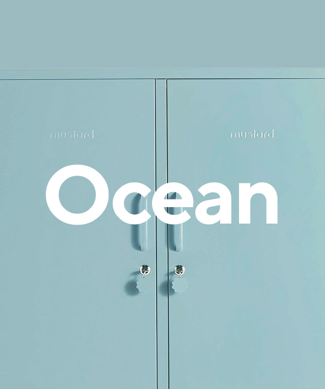
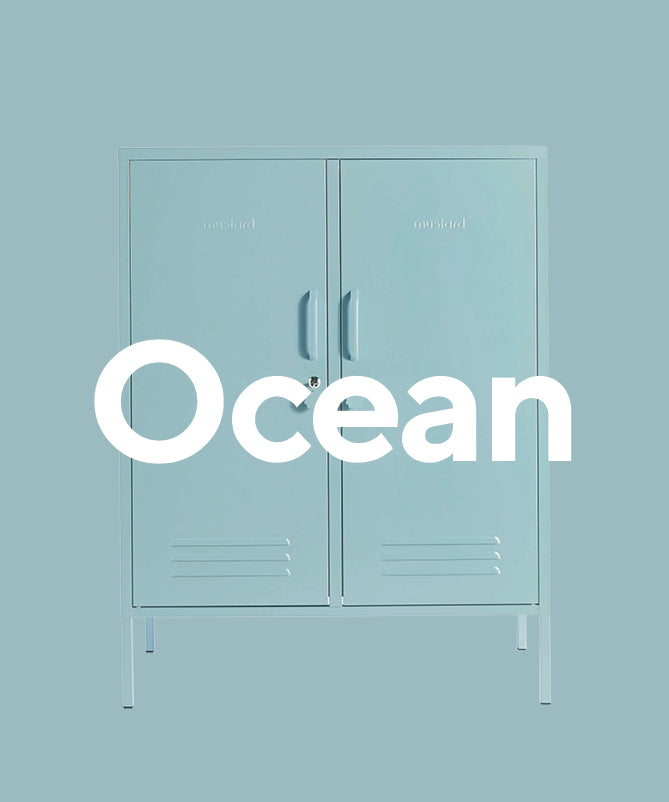
Ocean
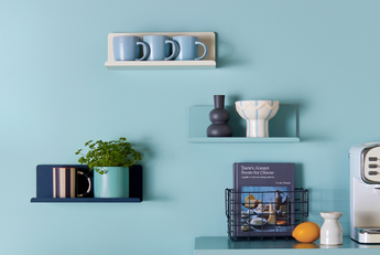
Ocean is a soft blue with slightly moody grey tones. It goes beautifully with Navy + White for a coastal vibe or go for some cute pastel shades with Blush and Sage. Our Ocean blue is super versatile + works for all ages.

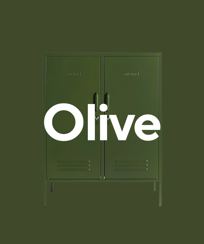
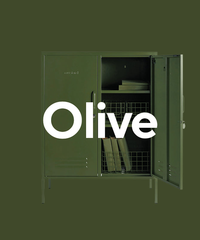
Olive
Olive is our classic earthy green - fun fact, it was the colour Becca originally had in mind when starting Mustard! A dark green but not too deep, it is smooth, subtle + goes perfectly with Sage + Blush.

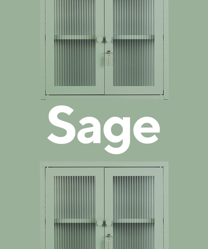
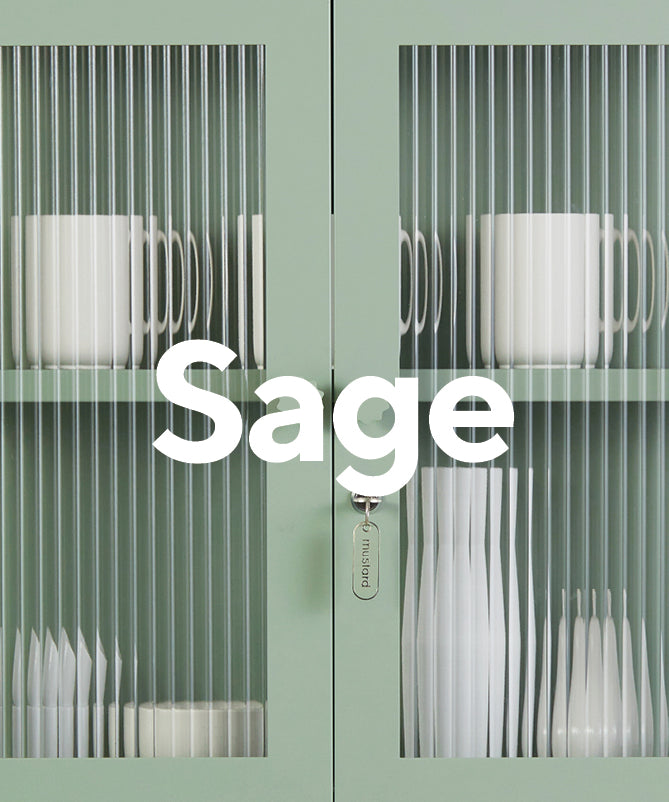
Sage
Say hello to Sage, one of our prettiest pastels. Sage is an earthy pale green made to add a subtle colour to a neutral palette + complement our range perfectly. We love pairing Sage with Olive, White, Ocean + Blush.

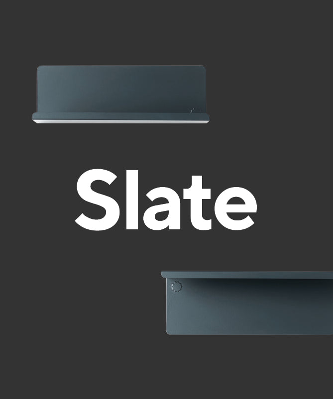
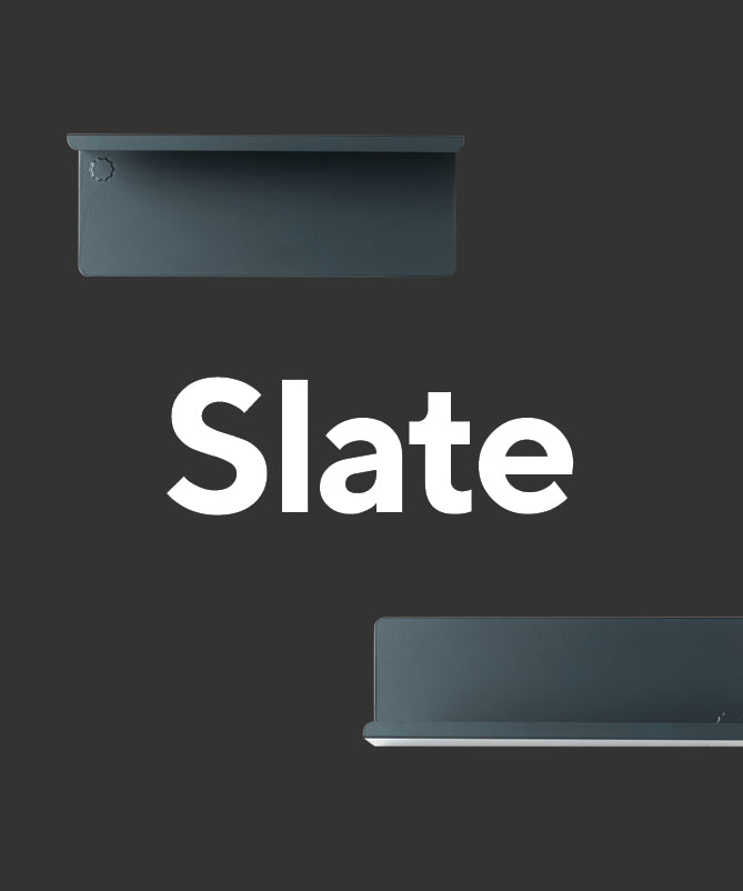
Slate
Valspar Sooty Lashes
Slate is the cool kid around here. It is a dark, smoky matte grey which fits right into a muted, industrial setting. Pair it with White for a classic monochrome look, or go bold with a combo of Slate, Mustard + Berry.

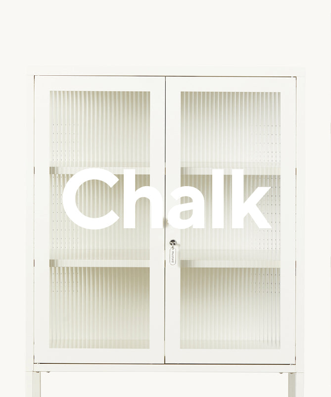
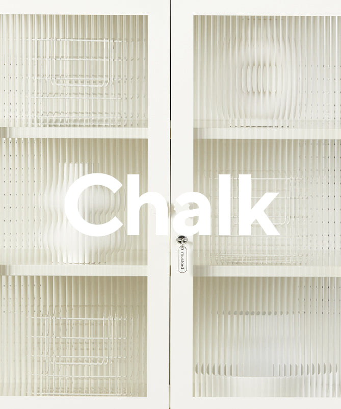
Chalk
Valspar Welcoming White
Choose Chalk for that classic school locker vibe. We love to pair Chalk with our pastels for something dreamy, but she pretty much goes with anything! Our Chalk is not a pure white but has slightly creamy, warm undertones, for a softer, calmer feel.
We’re big fans of a bit of matchy-matching, a locker against a wall painted the same colour can create some really bold monochromatic looks! If you decide to get the paintbrushes out and give it a go yourself, don’t forget to tag us on Instagram @mustardmade - we would love to see what you come up with!
Leave a comment